


Get to know the elements of our corporate visual identity
Puntored is based on three pillars that will continue to mark the north of its actions. Three pillars that have consolidated its trajectory and experience and that give way to this transformation process that recognizes its history.
The human dot is one of the key elements to generate brand differentiation in the competitive environment. Its construction is based on the evolution of the rhombus, and together with the upper magenta dot it forms a person, giving it a human and close character to the brand.
For correspondent graphic pieces, magenta will be used exclusively as the base color and the logo in a white monochromatic version.
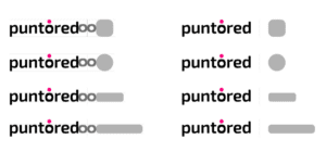
The Puntored logo can coexist with other logos keeping a special distance and proportions in order not to lose visibility and forcefulness.
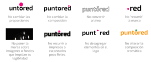
Some incorrect uses of the Puntored logo. It is important to clarify that the proportions, allowed colors and integrity must be respected in order to maintain the coherence and impact of the brand over time.
In this manual you will find the essence of the Puntored brand, what makes it special and how to understand and manage its visual identity from its strategic understanding to how to work with its brand elements.
Subscribe to our newsletter

Calle 100 No 19 – 61, 9th floor, Edificio Empresarial Calle 100, Bogota WhatsApp: 313 5559768 servicioal.cliente@puntored.co

Join the conversation
Join the conversation
This website uses cookies to enhance your experience. Some are essential for site functionality, while others help us analyze and improve your usage experience. Please review your options and make your choice.
If you are under 16 years old, please ensure that you have received consent from your parent or guardian for any non-essential cookies.
Your privacy is important to us. You can adjust your cookie settings at any time. For more information about how we use data, please read our privacy policy. You may change your preferences at any time by clicking on the settings button below.
Note that if you choose to disable some types of cookies, it may impact your experience of the site and the services we are able to offer.
Some required resources have been blocked, which can affect third-party services and may cause the site to not function properly.
This website uses cookies to enhance your browsing experience and ensure the site functions properly. By continuing to use this site, you acknowledge and accept our use of cookies.